Developers unearth the bones of an overhauled Task Manager for Windows 11

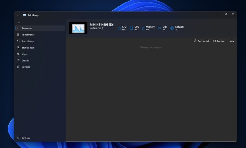
Enlarge / A look at the Windows 11-style Task Manager, with Mica theming and dark mode support. (credit: FireCubeStudios)
Microsoft's piecemeal approach to updating and unifying Windows 11's new look has led to updates for all kinds of old and obscure corners of the operating system, including everything from the volume indicator and the system icons to the humble Paint, Calculator, and Notepad apps. The next app to get its once-every-decade-or-two design renovation may be the Windows Task Manager, and it would be the first major update since Windows 8 came out a decade ago.
The Verge reports that engineering student Gustave Monce spotted the new Task Manager design lurking in a current preview build of Windows 11 (the FireCube Studios Twitter account later posted instructions for enabling it yourself). The app's basic structure is visible in these builds—like all Windows 11-era apps, the window uses Mica theming and has dark mode support, and it trades the current Task Manager's horizontal row of tabs for a vertical stack of navigation buttons that mirrors the modern Settings and Windows Security apps. Those text labels will also collapse into a vertical stack of buttons if the window is resized.
-

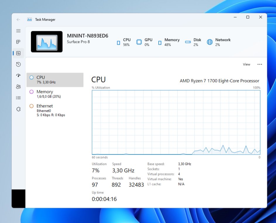
Redesign aside, the new Task Manager looks like it does the same things that the current one does. Also note how the navigation buttons on the left have collapsed to hide the text labels and make more room for the window content. [credit: FireCubeStudios ]
According to screenshots posted by users who have the new Task Manager working, it doesn't look like the redesigned app includes significant functional improvements; the vertical buttons all correspond to the tabs in the current Task Manager, and the views for monitoring processes and resource usage all look pretty much the same as they do now. But the new design is clearly a work in progress, and Microsoft may have more changes planned before it formally introduces the redesigned app to Windows Insiders.
Read 1 remaining paragraphs | Comments
source https://arstechnica.com/?p=1827135